Good design isn't about making things intuitive; it's about making
them idiot proof.
It should be "intuitive" that if you have a large sharp spinning
blade, you should keep your hands as far away from the blade as
possible. following this logic, it's hard to understand how people
didn't understand this and instead cut off parts of their fingers when
using a circular saw. After you have this happen a few hundred times
every year, you wise up to the fact that intuition is not
enough. It's better to put a guard around the blade to encourage
keep their hands away.
In the real world, this is called making it "idiot proof". This is
no easy task, because "idiots" are determined to do whatever they want
regardless of the consequences. They will move the guard out of the way
or completely remove it from a circular saw. They do this not
because they really are idiots (at least we hope not), but because
what good is a sharp spinning blade if a guard is blocking me from
cutting something.
Guards are completely counter-intuitive to the process of cutting.
Here is were good design comes in to make the guard move up as the wood
goes in, thereby allowing for both cutting and some protection. An even
better design would have the wood automatically feed in with no need
for fingers to get close.
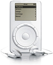
 The original Apple iPod was not all that
intuitive. Maybe the scroll wheel made sense to search up or down
through your list of songs, but an up and down button would have made
as much sense.
I think pushing a button twice to bring up another menu is
completely counter-intuitive. This happened to me by accident when I
first got my iPod. I push the middle button twice just messing around,
and the star-rating screen popped up. It was certainly not "intuitive"
that a button with no other markings needed to be pushed twice. It was
simple dumb luck that I found it. (Obviously I didn't read the manual -
why bother, it was supposed to be intuitive.)
The iPod and most other Apple products are designed around making
them "idiot proof". They have guards to keep their users from cutting
their fingers off.
This is evident from the fact that there is no delete button or any
combination of buttons you can push to accidentally delete a song from
your iPod. Many times I wish it did. I'm too lazy to check through my
song lists at my computer to make sure some dogs don't make it on the
list. But when I'm listening to my iPod and want to delete a bad pick,
I can't.
Apple designers asked a simple question: Is it better to allow for
song deletion if you can then accidentally delete song(s) you like, or
is it better to block any deletion? Their answer was simple: "Let's
make it idiot proof".
Let's imagine a phone support call in the alternate reality where
Apple added a grey delete button.
Support: How may I help you today?
User: I lost all the music from my iPod, and I want it
restored.
S. Did you push the grey button on the side labeled
"delete"?
U: Yes, but it was an accident.
S: Did you see the message that said push it again to
proceed or push the middle one to stop?
U: Yes, but I didn't understand what it was saying,
and I don't know where the middle one is.
S: Did you push the delete button twice?
U: Yes, but I was confused, and now I want the song
back.
S: You cannot restore it. You have to reload it from
you computer after deleting it.
U: Why not? I didn't want it deleted in the first
place!
S: We understand, but that is what the delete button
does. And that is why it asked you to confirm.
U: But why? I didn't want to delete that song, just
the one after it....
A few thousand calls like this would really raise the cost of
supporting the iPod. It's far cheaper and more "idiot proof" to prevent
all deletion. The added bonus is that I can play with the buttons on
the iPod all I want to and never screw anything up too bad.
Yes, I can set the volume to loud and ruin my hearing, but people
complained about that not being "idiot proof", and Apple had to fix
that too. Apple does a great job of making things easy to use while at
the same time protecting us from the spinning blades. This is a great
feat of engineering, but it's not always intuitive.
We'll look at some of the other ways that shows how Apple "gets it"
in their design in our next article. Until then, keep your finger safe
from spinning blades. 

 The
The 
