In continuing my "Replacing Entourage" series, I'll begin to
focus on iCal and the functions that it offers. To cover the
details of calendar and time management, to-do and task management,
and other time and project management ideas, it will take at least
two articles - probably three.
Today, I'll just discuss time and calendar management.
As calendar software goes, iCal has a lot to commend it. While
it's not as robust or feature-rich as some, it offers a simplicity
in calendaring that I like while covering the features I need.
Multiple Calendars
Probably the most familiar feature that makes iCal stand out is
the use of multiple calendars. Whereas Entourage and others allow
users to sort events within a single calendar and color-code them
and organize them by user-defined categories, iCal goes a different
way. In iCal, you set up separate calendars rather than categories
within a calendar, and you organize your events into these.
At first glimpse, it appears that iCal has simply accomplished
the same thing through a slightly different means. The real power
of this approach, though, is how easy this method makes viewing
select sets of events (and to-do items) without being distracted by
others. There are several ways to do this.
The most basic is the color-coding changes. When you set up a
new calendar, you select what color you want those events to be
rendered. For many users, each calendar will have a unique color
that can, in time, become easily recognizable as associated with a
certain set of events.
 "Fair
enough," you say, "but Entourage does the same thing with
color-coded categories." True, but the interactivity with these is
different, for when you select a particular calendar - either by
clicking on the calendar name in the Calendars list, or by clicking
on a certain event in the displayed view - that calendar is brought
to the front, and its color becomes the predominant color in the
display while the others are muted.
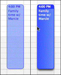
Thus, the calendar you've selected is easily distinguished
within the window, as are the events associated with it, as you can
see in the unselected (light blue) and selected (darker blue) items
in the image on the right.
This feature alone makes it easy to quickly distinguish between
the different sets of events in your life. But iCal takes it one
step further by allowing individual calendars - or even groups of
calendars - to be selected and deselected. When a calendar is
deselected, its associated events disappear from view completely!
This leaves a clean and obvious display of only those events that
you wish to view.
The possibilities that this feature-set opens up are many. You
can have entire sets of calendars devoted to things that you view
only occasionally - for example, sports schedules for your favorite
baseball teams - and can leave them hidden most of the time. When
you need to see it, it's so easy to compare it to the other
calendars for conflicts.
It's helpful for planning in certain "epochs" of your life, such
as a wedding or moving to a new house, that will consume you for
that season of time but be largely irrelevant after the fact; set
up a calendar for it, then delete or archive it after you're
done.
Published Calendars
This substantial feature-set also makes possible something that
many iCal users take advantage of: The ability to select certain
calendars and publish them for others without offering all of your
calendar data to the public.
For example, I keep an iCal calendar that details the
school-wide events for the small private school where I work. Any
student or family - or anyone else, for that matter - can subscribe
to this calendar and get real-time (or periodic) updates when new
events are added or existing events are changed. The events that go
into this calendar are limited to those that are truly public; they
don't get to see the committee meetings or parent conferences that
I have in a separate calendar.
.mac users can publish their calendars for public viewing and
subscription through their .mac accounts, but iCal users are not
limited to using .mac. A utility is available called iWebCal that publishes
calendars to the Web without a .mac account.
There are also several websites devoted to publicizing available
calendars and making subscriptions easy to establish. A few that
come to mind are iCalShare,
iCal Exchange, and iCal Hosting. You can also
find a selection through Apple's iCal
library.
Since iCal (and its published calendars) use the open "iCal"
standard - fast becoming a universal standard, not unlike the vCard
- other calendaring applications, such as Thunderbird Calendar and
Sunbird, can read them.
Calendar Views
The standard selection of calendar views - daily, weekly, and
monthly - are all available in iCal. I'm a little surprised that a
yearly view is not an option, but I'm willing to excuse it as one
that would overcrowd the application and threaten the streamlined
simplicity that it embodies. (I so seldom require a full-year view
in my calendar that this point is not really a substantial
complaint.)
Navigating from one view to another produces an odd result by
default: The window-size shifts depending on which view you select.
While distracting, there is some sense to this: There simply is
more information displayed in the monthly view than the daily view,
and the application is set to require only as much of your screen's
real estate as necessary to adequately display the information.
Understandable though this is, it bugged me, so I took my fate
into my own hands and performed a little hack: I'd learned that you
could set the windows to be the same size regardless of which view
you selected. I used the hack instructions (see
Set Identical iCal Window Sizes) and came out with a unified
view that was the best thing for my interface since Uno.
Switching views is easy: Three buttons at the bottom allow a
quick click switch. But iCal is also pretty keyboard-command ready:
cmd-1, -2, and -3 let you switch between day, week, or month views,
respectively.
Also, notice that you can change more specifically what you are
viewing: In the Preferences pane, specify the length of your work
week and workday, including when your day begins and ends. You may
also choose how many hours are displayed at once. (Hint: you can
also change the number of hours viewed in real-time by holding down
the "option" key while scrolling the wheel on your mouse. Thanks to
Tim Gaden for this tip.)
 The
Mini Calendar
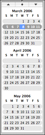
Users will find the "mini-month" calendars helpful to keep open
in all three views. These small calendars offer two quick
navigation helpers: first, and most obviously, they allow you to
quickly move from the date(s) currently in view to another day,
week, or month - and since they include arrows (at the top) that
let you scroll through the months quickly, you can jump ahead or
back with relative ease.
The other handy nav-helper is the button with the diamond icon
in the middle, between the scroll arrows: This button automatically
jumps to the current date, so after you're done looking ahead for
your vacation time in six months or back to the meetings you
already spent on that topic, you can easily return to the current
date. (I remember Entourage requiring a couple of clicks and a menu
to accomplish this simple task!)
By the way, you can also do this by keyboard-command: command-T
will jump to today, while shift-command-T will allow you to select
a date to jump to. Command + a left or right arrow will move to
previous or next view, be it day, week, or month.
Other Commands
 Other information tools are
available through basic buttons: Joining the "mini-month"
activation button, the standard "plus" button adds new calendars,
and another button (the one that looks like an in box) replaces the
mini-month view with a "notifications" view. I'd like it if you
could show both mini-months and notifications, but for some reason
Apple doesn't offer that. As a result, I leave notifications always
off.
 On the other side of the
window, you'll find three more buttons: The first, which looks like
it could be a task-list, actually toggles the view for search
results; Spotlight works quite well within iCal, and searches are
efficiently displayed in a small box at the bottom - and easily
hidden. (An aside: Despite the mixed feelings that many have about
Spotlight, my finding is that it works extremely effectively when
utilized within an application that employs it. To wit, none of the
reflections on Spotlight's shortcomings have spoken negatively
about this.)
The second button, with a "push-pin" icon, reveals or hides the
to-do list. (I'll discuss to-do lists in detail next week.) My
biggest complaint here: Why not use the list-like button for to-do
items and the more familiar magnifying-glass icon for the
search?
The last button reveals the "info" window/drawer, which I'll
address in more detail in a future article. You can select which
you prefer: If it shows up as a drawer (the default, I believe) and
you prefer a window, select "Detach Info" from the Window menu. The
reverse is also true - "Attach Window" will be the option to return
it to drawer status.
Personally, I prefer the drawer, and I keep it open all the time
in all views. I have also resized the drawer to be as narrow as
possible (which you can do, also, without a hack - even though the
usual three lines are absent from the lower right-hand corner, you
can still grab it with your mouse and drag it to resize).
I've maximized my window to fill the screen. On my 12" iBook,
this gives me full display of as much information as possible, and
it's just about right. Would I keep it smaller if I had a larger
screen? Probably not; I like to have as much information in view as
I can.
iCal Weaknesses and Add-ons
iCal has a few fairly significant weak spots. One that many
complain about is the inability to give each event an alarm by
default. Since I don't use alarms very much, I don't find this a
problem; I think I would quickly get annoyed if this was the
default. If you would prefer it, however, there's a helpful tool
called iCalFix
that changes this to add an alarm to every event by default.
As usual, there are some nifty doodads that are available to
soup up your iCal. iCalMail will
let you schedule a message to be emailed at a specified time.
iCalViewer lets you
display your iCal contents on your desktop - I tried this for a
while, but I didn't care for it much. I do like the Dashboard
widget called
iCal Events, which does a great job of displaying upcoming
events.
Users of older versions who are frustrated by the lack of
birthday transfer from Address Book will be glad for the tool
called iCal
Birthday Shifter. (iCal version 2.x, which ships with OS X
10.4.x "Tiger", will find that Address Book already supports this
feature.)
And those in need of Microsoft Exchange compatibility for
calendar-sharing will, perhaps, find Snerdware's GroupCal (US$55) a helpful
option. (Be warned, however: A reader reports that some of
Snerdware's products are not currently compatible with the latest
version of OS X, v.10.4.x.)
Check back next week when I discuss task and project management
in iCal and other applications. 

 "Fair
enough," you say, "but Entourage does the same thing with
color-coded categories." True, but the interactivity with these is
different, for when you select a particular calendar - either by
clicking on the calendar name in the Calendars list, or by clicking
on a certain event in the displayed view - that calendar is brought
to the front, and its color becomes the predominant color in the
display while the others are muted.
 The
Mini Calendar
