Dan Knight
- 2007.05.02
We've received a lot of email about 30 Top Mac User Mistakes: How Many Are
Apple's Fault? They range from explaining the history of the
way various keys are used and marked to the fact that it's too easy
to delete an icon from the Dock. For the most part we're dealing
with user errors, but Apple's use of "Delete" on the Backspace key
not only confuses switchers but is also contrary to ISO
standards. - Tip Jar
'30 Mistakes' Are Mostly User Mistakes
Our own Alan Zisman writes:
Good article - and one I'd been thinking of writing, since I
have several Windows-users at my work switching. Instead, I emailed
them links to your article.
A few comments:
3. Creating endless untitled folders
Yeah, this one is a problem. The Finder should pop
up a dialog box every time you create "Untitled Folder" and ask you
to name it - perhaps even insist that you do so. Longtime Mac users
are used to this behavior, but there's nothing intuitive about
making a new folder and not putting a label on it right away.
I'm surprised to see this listed as a Mac problem. I see lots of
New Folder, New Folder (2), etc. folders on some Windows users'
systems from users who have learned enough to create new folders
but haven't learned to give them unique and useful names.
5. Confusing the concept of wallpaper with
screensaver
I haven't spent enough time on Windows to
understand the problem. Wallpaper is the Windows term for a desktop
picture, and a screensaver is a screensaver - not a background
image.
Lots of Windows users seem to use these terms interchangeably -
but they're the same people who use the term "downloading" when
referring to copying a file. I don't think it's a Windows-user
issue per se but simply that people are getting computers (at home
or at work) without any training - and then misusing vocabulary
they've heard but never had explained.
Since the bulk of newbie computer users get Windows systems, it
appears to be a Windows-user issue but isn't . . . it's a
new user issue.
8. Not using any keyboard shortcuts
Again, if they use keyboard shortcuts on Windows,
they'll learn to do the same thing on the Mac. If anything, the Mac
makes it easier by displaying keyboard shortcuts in the pulldown
menus.
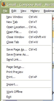 Many/most Windows programs do this too
. . . in most cases, I believe it's up to the programmers
- on both platforms. (See attached Firefox (Win) screen
capture.)
10. Renaming desktop icons to random characters
because they don't understand the difference between the enter and
the return key on Mac. (Enter puts an icon into rename
mode).
Huh? I have to admit that I wasn't aware of this,
as I usually just click on the icon's name when I want to change it
rather than on the icon itself. And I couldn't test it immediately,
as I use a Logitech keyboard that may not work the same way as an
Apple keyboard.
The funny thing is, after I dug a Mac keyboard out
of the basement and plugged it in, I found that both the Return and
Enter keys worked exactly the same way. Click on an icon, press
either key, and type in a new name. Then hit either key to finish
renaming the file.
What do Windows users expect to happen when they
single-click on an icon and then hit the Enter or Return key?
Double-clicking an icon is the standard way of launching an app in
either Windows or the Mac OS.
Single-clicking on an icon and then pressing Enter in Windows
will open the program. To rename an icon, click on it to select it,
then slowly (slower than double-clicking) click on the icon caption
and you can rename it. I haven't run into the listed situation
either on Windows or on a Mac.
Recommendations:
1. Give us a two-button mouse with two buttons,
not a second pseudo-button. (No, it's not on Warne's list, but it
should be. How in the world is a new user going to intuit that the
Mighty Mouse can function as a two button mouse when there's no
visual indication of a second button?)
Equally a problem with the Mighty Mouse and new Macs is that
one-button behaviour is the system default; as a result, new users
assume they've got a one-button mouse until someone tells them
otherwise.
Alan,
Thanks for sharing your thoughts. You obviously
know a lot more about Windows than I do. You're right - a lot of
these are newbie problems, not Mac or Windows problems per se.
I can't quite fathom what Microsoft was thinking
by making single-clicking an icon and then hitting Return or Enter
do the same thing as a double-click. Seems inefficient.
You're dead on about Mighty Mouse behavior. Not
only does it not look like a two-button mouse, it doesn't even act
like one unless you have the savvy to open System Preferences,
select Keyboard & Mouse, and enable two-button functionality.
It's almost like Apple threw all this technology into the new mouse
but doesn't want people to use it.
Dan
Windows carries over pieces of design from days when mice were
not common on PCs. In fact, MS used to bundle Microsoft Mouse
hardware along with software like Windows 2.0, Word (the early DOS
version), or a paint program. I suspect the behaviour that you find
odd (and I find normal) has those roots - you could select an
object my moving with the keyboard cursors, then press Enter for
its default behaviour (opening a document, running a program,
etc.).
Through Windows 3.1, virtually everything in Windows was doable
with keyboard alone - even if awkwardly. The top-left icon on the
title bar of windows (accessible with Alt-spacebar, if I'm
remembering right) included menu items to minimize, maximize, and
even resize and move a window - all with keyboard alone. Awkward,
but doable.
The rise of the right-click context menu made the use of
keyboards in these ways even harder - Microsoft's response was the
addition of two new keys to its keyboards; one, the so-called
Windows key, seems to have stuck; the second one (which had a logo
sort of looking like a context menu) is pretty obscure but seems to
have been designed to mimic a right-click. The keyboard on the Dell
notebook sitting by my desk lacks that key entirely; the Logitech
keyboard on my son's desktop has one of them to the right of the
spacebar, but I suspect it's never been pushed.
In the Visual Basic programming environment, there are "tabset"
options - the ability to numerically order all the objects in a
window or dialogue box being designed so that pressing Tab moves in
sequence around the window - again, a remnant of the time when
people didn't use the mouse to move from field to field or button
to button. In some circumstances - database entry, for instance -
it is more efficient to be able to keep your hands on the
keyboard without needing to grope around to find the mouse. But it
requires more user training.
Backspace vs. Delete and ISO Standards
James David Mason writes:
27. Confusing "delete" with "backspace" (because Apple has
two keys named "delete" on the keyboard, one of which does forward
delete and the other backward delete. Way to go, usability
geniuses).
Yep, Apple has long messed up on this one. It's driven me crazy
since the first Mac.
Your Logitech keyboard follows ISO/IEC 9995, the
international standard for keyboard layouts. The standard appears
to be up to Version 8; it's developed by ISO/IEC JTC1/SC35, which
has its headquarters at AFNOR, the French national standards body.
There are many national variants on the alphanumeric sections of
the keyboard (e.g., for accented character sets and for local
variants like the AZERTY keyboard used in France rather than the
more common QWERTY), but there's uniformity that the key in the
upper right corner is BACKSPACE.
Actually, there are two issues here: One is the layout of the
keyboard, and the other is the bit combination produced by the
keys. The BACKSPACE key is always mapped (even in Apple's
mislabeled version) to the code BS (which obviously comes from
BackSpace), Hex 08, and the DELETE key to the code DEL, Hex 7F.
These codes go all the way back to ASCII (ANSI X3.4-1967, ISO
646-IRV-1972) and have been carried forwards in all the later
coding standards (e.g., ISO 8859). The current coding standards
(UNICODE or ISO/IEC 10646) address only the printing characters and
leave the control sequences intact from where they were 20+ years
ago. (Some of the sequences, like BEL, actually go back to Teletype
usage.)
I've always been bothered that the Mac keyboard emitted the code
for BS and also operated as a Backspace key, but they put "delete"
on it. I've always written it off as probably being in the class
with Steve Jobs's insistence on one-button mice and his hatred of
fans in computers, something else that was wrong with the original Mac and why we all hung
external fans on things down through the Plus. (I had a Plus at work; an SE/30 was the first at home, and I still
have that, along with a bunch of later things.)
I wish I could give you the text of the standards, but ISO is
really nasty about copyrights and won't put the things up on the
'Net. There is a pretty good page about the control sequences at
http://www.omnifarious.org/~eljay/puter_iso-646-irv-1972.html
James David Mason
Chairman, ISO/IEC JTC1/SC34
http://www1.y12.doe.gov/capabilities/sgml/sc34.htm
http://www.jtc1sc34.org/
(We're the folks who created SGML and so gave birth to HTML and
XML. Macs are the most common computers in the committee.)
James,
Thanks for writing - and it's great to hear Macs
have made such inroads with an international standard body.
I can't find much info on the Apple II and Apple
III keyboards, but it seems they did have a Delete key. The Lisa
keyboard definitely had a Backspace key where Apple now has
Delete - and the same is true of
the original Macintosh keyboard. It looks like the change came
when Apple introduced the Extended
Keyboard in 1987.
Why Apple broke with convention - both
industrywide and their own earlier Macs - to name the backspace key
Delete seems to be unknown. It wasn't a Steve Jobs thing, as he was
gone long before the ADB keyboards, the first to do this, came into
being.
Dan
Jim Mason responds:
I've always found Apple's eccentricities with keyboards and mice
mildly annoying, though not enough to keep me from using/buying
their stuff. I'm a touch typist, so I just ignore what's printed on
the keys. The ADB Extended Keyboard feels good enough. I use
third-party mice, even with ADB machines.
Maybe somebody at Apple got allergic to
Ctrl-Alt-Del and decided not to have any of those named on the
keyboard.
You have more resources on old Macs than I do; my oldest machine
is the SE/30, and it has an ADB Extended Keyboard, as does the old
8500 I have at work. My main machine
at home is one of the late PB G4 15"
things, though I also have a modified WallStreet; my wife has a much modified
B&W G3 that now has a 1 GHz
G4 in it. Still, I think calling that key "Delete" is dumb when its
action is BS. Maybe somebody at Apple got allergic to Ctrl-Alt-Del
and decided not to have any of those named on the keyboard.
I have a Mac because I like the machine and it runs Unix. I've
been in computing about 30 years, and I've run just about anything
except IBM mainframes. I grew up on Unix, first on Dec PDP-11s,
then Suns. PCs are just something I've put up with because that's
what my employers use.
In my ISO committee it used to be that most people had Toshibas,
then it was Dells. Now the most common are Macs (iBook, PB G4,
MacBook Pro), followed by ThinkPads. One of the most recent
converts used to run Linux on Dells. He got burned by Dell once too
often, and now he has a MacBook
17".
Because we're international, I see a lot of gear that isn't sold
in North America (like Siemens, Samsung and Panasonic laptops), but
Macs and ThinkPads are pretty well distributed around the
world.
Jim Mason
Share Your Thoughts with Apple
Abraham Brody writes:
Dear Mr. Knight,
I saw your article on Low End Mac and thought it very well done.
I would like to add one more thing to that article. Direct people
to <http://www.apple.com/feedback/>
so they can suggest the features they want the most.
Sincerely,
Abraham
Thanks for the suggestion, Abraham. I'll share it
in our next mailbag column.
Dan
Hitting Enter on an Icon in Windows
Danny K writes:
Dan,
In the 30 Top Mac User
Mistakes, you wrote:
What do Windows users expect to happen when they
single-click on an icon and then hit the Enter or Return key?
Double-clicking an icon is the standard way of launching an app in
either Windows or the Mac OS.
The answer is that when Windows users hit Enter on an icon, it
opens - if it's a document, it opens the registered application. If
it's a shortcut (alias on the Mac), it opens whatever is attached
to the shortcut.
Danny K
Better Keyboard Markings Found on Other
Keyboards
John Muir writes:
Hi,
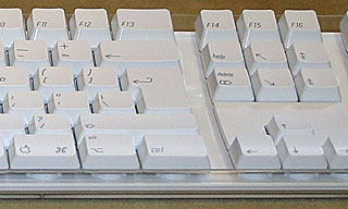 I
never realised Apple's American keyboards were so confusingly
labeled when it comes to delete keys. In Britain, Apple have been
using a backspace graphic (along with the rest of the industry)
since what seems to be forever. A quick Google for a good
resolution Apple UK keyboard returned this:
http://adlib.blogs.com/andyblog/images/IMG_0019_1.jpg
I knew that the option key is written "option" on US keyboards
already, which seems a bit strange as its single character graphic
seems clear enough to me and features in all of the Mac's menus. In
fact I think it would things clear up if option just had that
symbol on it (no "option" or "alt") and command was labelled with
just the clover symbol instead of also bearing an apple. There are
surprisingly many Mac users out there who call the keys "alt"
and/or "apple", which is needless confusion.
There is generally a preference for graphics over textual
designs in Britain, which probably explains why all keyboards have
had backspace marked that way here at least since the 1980s. Our
roadsigns are also as non-wordy as possible (though not always for
the better).
As for "mistake 22", I think it's meant to be the "puff of
smoke" action, which happens when dragging app icons from the Dock.
This can seem strange to new users, especially since it happens
without a question and can be triggered accidentally via fairly
small mouse movements. I found it a bit odd when I switched some
years ago too.
John Muir
John,
Thanks for sharing the info on the UK Mac
keyboard. On the one hand, marking keys with graphics is simpler
and more intuitive than putting words on them. On the other hand,
it's a lot easier to write about the Delete, Backspace, Enter,
Return, Tab, Command, Option, or Control key as the graphics on the
keycaps aren't part of the character set.
I like the graphics used for Page Up and Page
Down, but my first reaction to the Home (arrow pointing to upper
left) and End (arrow pointing to lower right) keys is mixed. That
said, I've been using keyboards with Home, End, Page Up, etc. keys
since the first IBM PCs shipped in 1981, so it takes a little time
to adapt to change. (You should have seen my initial struggles with
the Mac when I was a confirmed DOS user!)
Thanks for your thoughts on "mistake 22" - it
shouldn't be that easy to remove something from the Dock. Apple
usability experts, are you listening?
Dan
Hi,
You're quite right about the Home and End arrows, and indeed the
whole question of how to write and even say the names of keys. I
suppose it's a matter of first introduction. We have signs for "no
left turn" and "maximum speed 40" and "roadworks/construction
ahead" too, which are just graphics instead of the words, though we
all know what to call them. I guess it's a matter of seeing and
hearing these things separately, but knowing they are just the one
idea.
In the 80s I started out on a TRS-80, Commodore VIC 20, and BBC
Micro, and from what I remember their keys were more wordy than
things are now. Especially the old habit where manufacturers would
squeeze long words onto the same small key caps. Differently sized
keys are one of the better legacies of the IBM PC . . .
if that was even where they came from.
I guess what I'd like to see most is Apple drop the "alt" tag on
option and the Apple logo on command, instead calling the keys
"Option" and "Command" in print, with the two symbols also placed
on the keys. Home and End seem to be less of a problem, for
whatever reason. People here remember what and where they are. I
imagine it's simply that there's only one name for Home and one for
End!
John Muir
Too Easy to 'Poof' Something Off the Dock
Peter Blier says:
Hi Dan-
On this point:
22. Inadvertant [sic] click-drags and removing
programs from the dock in the process.
Huh?
I think the author is commenting on how easy it to mistakenly
remove something from the Dock. If you accidentally drag an app off
the Dock, its icon goes "Poof." Disconcerting and frustrating, to
say the least. The Finder should ask you to confirm!
- Peter Blier
Agreed!
Accidentally Deleting an Icon from the Dock Too
Easy
Ed Hurtley writes:
The vast majority I fully agree with.
Number 22 you give a "huh?" to.
What I read that as is when people accidentally drag icons off
their Dock. They then think that the application is gone. I have
seen many novice OS X users think that every Application is on
the dock. "If it disappears from the dock, it must be gone."
For example, my daughter plays on our desktop Mac quite
regularly, often renaming icons (thanks to "Enter enters icon
rename mode") and dragging icons around, including off the Dock. I
then have to put them back on the Dock or else my wife doesn't know
where her Address Book went.
Ed
Thanks for sharing your real world experience with
this issue!
Dan
'Home' and 'End' in Microsoft Word
Dan:
There never was a version of Microsoft Word that didn't
use a mouse. I'm looking at the original MS Mouse, hanging like a
trophy on my wall. It was sold in a package with Word 1.0, which
needed a mouse to be workable. Except for the basic click to locate
the insertion point, mouse usage in Word 1.0 was unlike anything in
either the current Macintosh GUI or Windows. It was more influenced
by early, pre-X Windows, Unix GUIs. Clicking in the scroll bar, for
example, could mean "Scroll to here" or "Scroll this proportional
amount", depending on how it was done. But Word was never a
keyboard-only, character-based thingie like WordStar (which
actually came from CP/M, where I first encountered it on an Osborne
1), DisplayWrite, MultiMate, or WordPerfect.
The behavior of the "Home" and "End" keys also predates Word. I
had that sort of action on various kinds of terminals with
full-screen editors running under Unix in the early 80s. It's the
top/bottom of document that's eccentric usage (like labelling
BACKSPACE "Delete").
Actually, MS didn't create Word. They bought it, just as they
bought PC-DOS. Word was a rewriting of the text editor for the
Xerox Alpha workstation, and it had a mouse there. The mouse came
with it when the author left Xerox and came to MS. The Alpha was
the ancestor of the Star, which was the primary influence on the
creation of the Macintosh GUI. The mouse was, of course, invented
by Doug Engelbart, long before Xerox PARC adopted it.
Jim Mason
Jim,
My memory is a bit vague, but the Internet is a
great source of information. The original version of Word was
semi-WYSIWYG - it could display bold and italic - which definitely
gave it a leg up on the competition. And it did indeed support the
Microsoft Mouse.
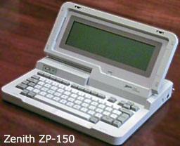 What I was recalling was the Zenith ZP-150, an early
and largely forgotten portable computer (introduced 1984 at
US$1,995 and blown out at US$699 in the Fall 1997 Heath/Zenith
catalog - I worked for a H/Z store and remember it well) that had
Microsoft Works built into it. The word processing module was
called Word, which helps explain my confusion. This was a
completely keyboard driven word processor.
Thanks for your pre-PC history lesson. While I can
understand using an End key to go to the end of a line rather than
the end of a document or end of a screen, I can't grasp the sense
of using a Home key to go to the beginning of a line. There should
have been a better way to label it - and "start" would only be
confusing.
Maybe they should have come up with separate keys
for these functions: Top to bring to you the start of a document,
Bottom to bring you to the end, End to bring you to the end of the
current line, and who knows what to bring you to the start of the
current line.
Dan
'Delete' Makes More Sense than 'Backspace'
I've been a long time reader of LEM and love the site. However,
I disagree with your point #27 in one of your more recent articles,
"30 Top Mac User Mistakes."
I completely agree with Apple's use of "Delete" on both "delete"
keys. The use of "backspace" can be interpreted in three ways:
- A literal backspace. So it shifts all characters on the current
line over by one character, inserting a space. The regular "space"
inserts a space and shifts the cursor one position to the right. A
"backspace" should insert a space and shift the cursor one position
to the left (essentially leaving it where it started off), hence
"backward space" or "backspace".
- Delete, which is what you think it should be
- A virtual nondestructive delete; functionality like this would
be the same as hitting "cursor left".
Since we want to delete a character, using the term
"delete" makes perfect sense. Apple saved themselves by adding a
directional arrow to the "other" delete key, which indicates the
direction of deletion.
Cheers,
Patrick
Hi Patrick,
You raise some good points. In the old days of
typewriters, the backspace key just moved you back one space -
nothing changed on the page you'd typed, which is similar to your
third option.
I have never heard of a backspace key being used
to insert a space to the right of the cursor, nor do I think anyone
would expect that behavior of a Backspace key. That said, there's
nothing intuitive about a key marked Backspace deleting
content.
The only problem with Delete is that in the rest
of the computing world, that means deleting the character to the
right of the cursor. Perhaps the ultimate solution is to dispense
with text labels completely and use icons to mark these keys.
Dan
Dan Knight has been publishing Low
End Mac since April 1997. Mailbag columns come from email responses to his Mac Musings, Mac Daniel, Online Tech Journal, and other columns on the site.

 Many/most Windows programs do this too
. . . in most cases, I believe it's up to the programmers
- on both platforms. (See attached Firefox (Win) screen
capture.)
 I
never realised Apple's American keyboards were so confusingly
labeled when it comes to delete keys. In Britain, Apple have been
using a backspace graphic (along with the rest of the industry)
since what seems to be forever. A quick Google for a good
resolution Apple UK keyboard returned this:
 What I was recalling was the
